Ideas For A New Banner!

newdawnfades

Senior Member
Joined
Oct 17, 2005
Posts
1,848
Reaction score
5
Location
In a state of deep, deep fascination
Shaggy and I have been talking about putting together a new banner and we've decided to solicit some ideas from you folks here since you'll be the one's having to look at it every time you log in.

So here's what we need:

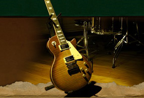
1. What 5-6 band, album, rock images do you think should be included? Please post the actual image on your post. We are looking for images that are definitive of classic rock as a whole, so no requests for Dokken or Poison pictures please. ;)

2. What kind of catchy slogan would you include in the banner if there was one?

3. Are there any cool ideas that you can think of that should be included in the banner? For example, how YOU would design it, how the layout should look, what color scheme you would use, or any other considerations you think we should be accounting for when we arrive at a banner, .

4. If you want to take a crack at it, design your own logo and send it via PM to me. If we get a few submissions we might be able to put it to a vote, or we could have our members here review it.

So we need feedback. Let us know what you want so we can get started on a brand new DEFINITIVE CRF banner.
 
Last edited:

Music Wench

Rock and Roll Grandma
Joined
Oct 18, 2005
Posts
2,966
Reaction score
5
Location
Michigan
Red and black or blue for color scheme. Red and black is a great combination. I frequent a site with that combo and it really looks great.

I'll work on the albums/images as time permits. I've got a few ideas but I'll have to go look for them.

Slogans? Well, how about "Welcome to the Dark Side...?" Sorry, I couldn't help it. I'll work on a slogan too.
 

energydude

Banned
Joined
Jan 3, 2006
Posts
83
Reaction score
0
Today, 03:24 PM #3
Music Wench
Rock and Roll Grandma


Join Date: Oct 2005
Location: Michigan
Age: 46
Posts: 1,330 Re: Ideas For A New Banner!

--------------------------------------------------------------------------------

Red and black or blue for color scheme. Red and black is a great combination. I frequent a site with that combo and it really looks great.

I'll work on the albums/images as time permits. I've got a few ideas but I'll have to go look for them.

Slogans? Well, how about "Welcome to the Dark Side...?" Sorry, I couldn't help it. I'll work on a slogan too.
__________________
"Reality is just a collective hunch." Lily Tomlin

www.flyingfunkradio.com


yea red and black sounds cool and maybe snakes...........i like snakes
 

RoxorFuxor

Awesome Monger
Joined
Feb 1, 2006
Posts
101
Reaction score
1
I will try my hand at designing one, I am pretty good with graphics. Do you want it to say "Classic Rock Forums" or "ClassicRockForums.com"? What are the size limitations?

Here is some of my GFX work so you can judge whether I am going to turn out something good or not:
http://gladmorin.xepher.net/popout.png
http://gladmorin.xepher.net/napalm.png
http://gladmorin.xepher.net/anthony.jpg
http://gladmorin.xepher.net/napalmgirl.jpg
http://gladmorin.xepher.net/sword.png

And on a larger scale:
http://gladmorin.xepher.net/plasback.jpg
 

PickAttack

ZIG ZAG MAN
Joined
Jan 24, 2006
Posts
69
Reaction score
0
Location
Armpit of America
Don't know what kind of size you're looking for but maybe a time machine collage of some kind with small pics from the classic rock era would be cool....

1. Pot Leaves, Mushrooms
2. Vans/Hippies/VW's
3. LP's , 8-tracks
4. Vietnam pics
5. Peace Sign/Tie Dye colors.
6. Incense
7. Black Lights
8. Typical Hendrix, Zepplin, Joplin. CSN&Y, whatever pics.
9. President pics of the classic rock era.
10.Goofy H.S. pics from that era.
11.Whatever I'm leaving out pics...
12. "Classic Rock, the time when Musicans used to experiment with drugs
instead of people on drugs experimenting with Music".

and I'm not a designer so I'm sort of clueless as to putting this together....
 

newdawnfades

Senior Member
Joined
Oct 17, 2005
Posts
1,848
Reaction score
5
Location
In a state of deep, deep fascination
RoxorFuxor said:
I will try my hand at designing one, I am pretty good with graphics. Do you want it to say "Classic Rock Forums" or "ClassicRockForums.com"? What are the size limitations?

ClassicRockForums.com would more appropriate. As far as size, we don't want it to take up too much of the screen, approximately what we have now would be fine (935 x 100), maybe a little thicker if need be.

Good work btw. You've designed some nice graphics.
 

Shaggy

Administrator
Staff member
Administrator
Joined
Apr 3, 2005
Posts
1,054
Reaction score
50
Location
Behind the wheel!
newdawnfades said:
ClassicRockForums.com would more appropriate. As far as size, we don't want it to take up too much of the screen, approximately what we have now would be fine (935 x 100), maybe a little thicker if need be.

Good work btw. You've designed some nice graphics.

Dittio, sounds good to me. Lets see what you can come up with?
 

RoxorFuxor

Awesome Monger
Joined
Feb 1, 2006
Posts
101
Reaction score
1
I was thinking about doing a GIF with it flashing pictures of some of the greats (Zeppelin, Stones, Hendrix, Beatles and Black Sabbath). All the while "ClassicRockForums.com" would be in the background, kind of dimmed out. It will be tricky though, it will either come out nicely or crappy.

EDIT: Well, I made a banner, I am not sure how I feel about it. It wasn't something I am use to (I rarely work with photos and I pretty much only do abstract). I am going to post it just incase you guys like it.
crf.gif
 
Last edited:

Find member

Latest posts

Forum statistics

Threads
30,725
Posts
1,068,817
Members
6,367
Latest member
allmylife11

Staff online

Members online

Top